Online E-commerce done correctly
E-commerce
Posted by Adam Hayes
Online e-commerce done correctly.
I was very impressed with Utrecht Art's confirmation page (and a few other nice things about the way they do their online shopping experience.
- Provide promo code on their site. (and had it prepopulate the promo code once you get to the checkout page)
- Best sellers for each and every category, not just sitewide.
-
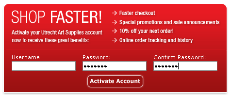
Simple two item signup/registration form after the confirmation page.
On site Promotion Codes
The first thing that I loved was that they gave out a promotion code for 20% of any of their normally in-stock items. And then not only did they give you the code, but once you got to the checkout page, the code was already typed into the promotion code box, how user-friendly is that?
Category Best Sellers
Next they had "best sellers" in every category. Not just a couple of items for site-wide, but within each category, which made picking out the "most common" items a cinch.
Post Checkout Signup Process

Last they did user registration the correct way. Only two fields, and after the checkout process. Plus they list some great reasons to signup (one of which includes a 10% promotion code which I know will work because I have already had success with their last promotion code.
